My First Poster Appropriation Ideas

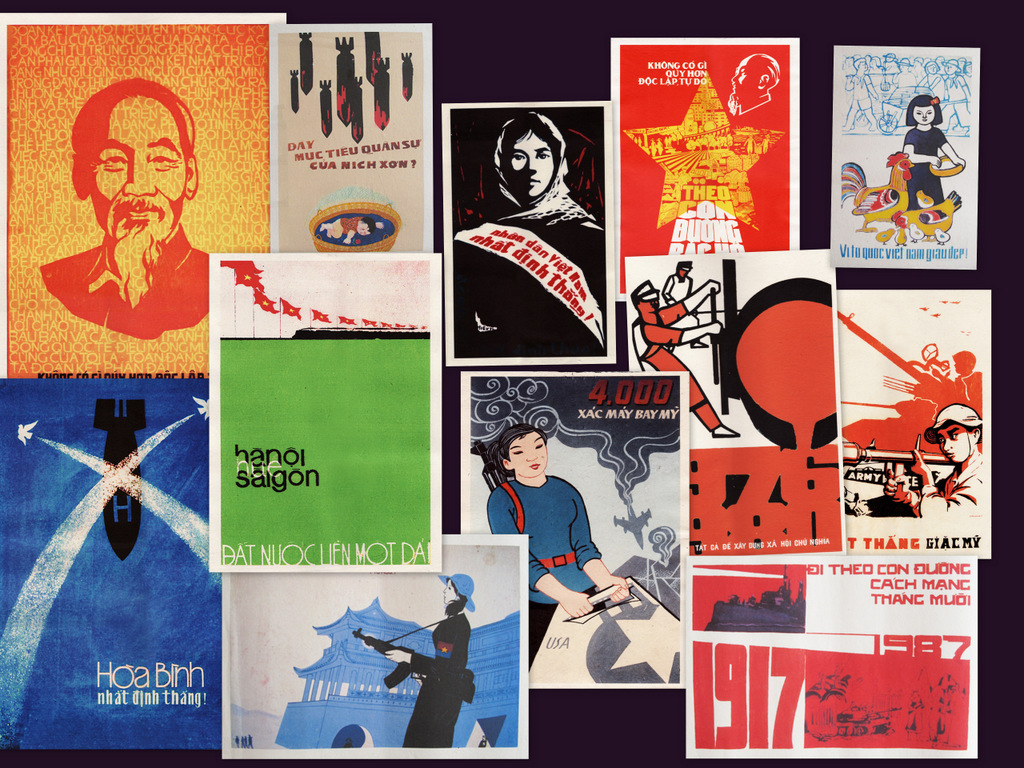
The first poster I choose to appropriate is Hanoi-Hue-Saigon: The Country Is United  (below) by artist Le Minh Ngu (1976). The poster was designed one year after the end of Vietnam War and the North and South Vietnam rejoined. I fell in love with the poster because of its gentle colors and peaceful composition.

Now, I would like to put a new tweak to it. Recently, Hanoi administrators have cut down over 6000 old trees in the city, creating public outrage. The reason is because these trees have great environmental, historical and social value to the city. Besides, admist many failed and untransparent actions by the government, people doubt that cutting down these trees will result in any good.

Hence, through my poster concept, I would like to convey the importance of green areas in the developing Vietnamese cities across the country. The main title of the poster, loosely translated, means “The Nation Needs Green Areas.” Above, I substituted the train with modern Vietnam city scapes. However, I am still experimenting with the fonts.

Hanoi – Hue – Saigon: The Country is United

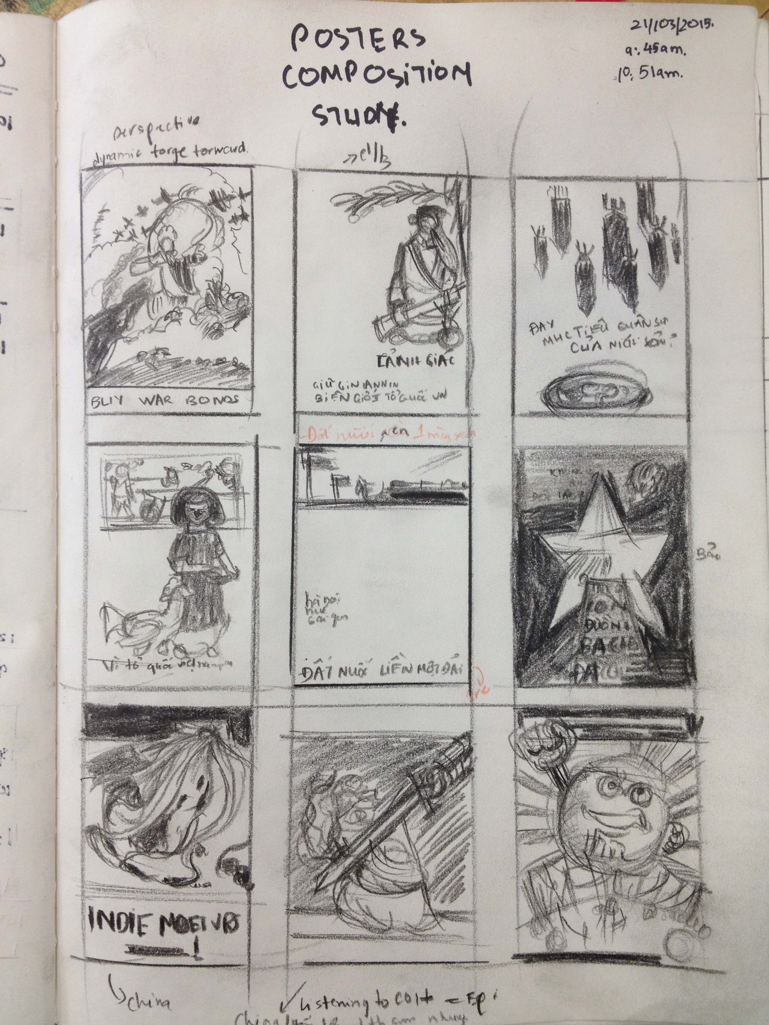
Prior to coming up with these ideas, I had studied the compositions of various posters to brainstorm new concepts.

Poster Thumnail Study


The Mesmerizing Beauty of Vintage Posters

My next Surface Project involves stealing a design of a vintage poster, ranging from war propaganda, 1950s scifi posters to circus posters, and insert a new concept to it.

As a result, besides searching for a bunch of images online, I made a trip to the library and found some visual treasures.

IMG_3273War is my favorite topic so I looked up many posters from World War 2. The collage includes my top favorites. The reason they draw my attention range from the concept, the perspective, the humor and the potential for me to impose a new concept on them.

WWII poster

Talking about the war, it would be a disgrace if I did not look up Vietnam War posters. And so I did. The design of Vietnamese propaganda posters at that time blew my mind with their creativity, concept and design.

Vietnam War Poster

I also looked up many scifi posters. Their complexities and intricacies intrigue me. But most importantly, all of them have great perspectives that draw my eyes in.

Scifi Posters

And lastly, I researched some circus posters. To me, it felt like travelling back to the golden age of circus while looking at these posters.

circus poster


Ideas For The Next Surface Project

My next project is about using patterns and colors. That’s it. The first thought which came to my mind was to create a set of patterns and paint them. However, I felt that it wasn’t enough.

Instead, even with patterns, I want my drawings and paintings to tell a story, which is my first rule. Thus, the story I want to tell is that of a little cat, burdened by the troubles and ordeals of life, decides to escape into space, even for just a while. Sitting on the moon, she marvels her problems and painful feelings flowing towards the sun, where they are all destroyed and a beautiful things come out of that destruction. For the cat, it is a cathartic experience.

And like any stories, I want my illustration to convey an emotion, forming the second rule.

This brings me the color rules I would like to apply to my illustration. They act as a framework and I expect a lot of developments as the work progresses.

1. The colors create an illusion of space, shape and form.

The setting of the illustration is in space, with planets and asteroids. Hence, an illusion which conveys distance and forms is essential.

2. Most colors are analogous.

As I want to atmosphere to be introspective, peaceful, yet marvelous, the colors will be mostly cool and mostly analogous.

3. A few colors are complimentary or split-complimentary

The contrasts created by these colors will help me bring out the main subjects of the illustration, which are the cat and the explosion.

Below are some of my color tests. I mostly just played with the colors to see what came out of the process.

Color Test Compiled.004 Color Test Compiled.003 Color Test Compiled.002 Color Test Compiled.001

Finding Inspiration For The Next Surface Project

My next Surface Project will be about creating patterns. However, pattern itself does not interest me. Beautiful patterns capture my attention because they are beautiful, but patterns which help tell a story are even more interesting. And so, I begin my quest to search for ideas and inspiration.

1. The Pattern Library

Beautiful website with gorgeous, professional designs. It’s awful lot to look at.

Pattern designs collection

Among all the designs on the website, the below is my favorite one. The gradients within each shape make the colors pop. Besides, the use of complimentary colors (orange, blue) and analogous colors (yellow, orange) is simple yet mesmerizing.

pattern-library

2. Matt Booth

As I am interested in patterns in context, my research brought me to Matt Booth, whose patterns form awesome illustrations. The artist uses local colors of the tiger but incorporates a cirlce-stick patterns to it. the individual components are disorganized and messy, yet when gathered, create a meaningful whole.

sumatran-01


3. You Are Stardust

Almost coincidentally, I stumbled upon this gorgeous illustration by Soyeon Kim for the children book You Are Stardust. I specifically like to geometry of the shape and how different values create shape. Besides, it is a subtle approach to using primary colors, of which the result is beautiful. The work fits perfectly into my vision of how patterns can be used to tell a story.

you_are_stardust

youarestardust5

4. Chi Do

It is not so much of a pattern design piece, but it can potentially be due to the seemingly uniformity of the steroids and space. Also, it inspires me to tell a story of my own.

Chi Do So You Are Fine


Color Theory Research – Mark Tansey

As part of the assignment, I am tasked with discovering the works of Mark Tansey. So as usual, I borrow a book about Mark Tansey from the library and learn about his works in conjunction with using the internet.

White on White is the one which interests me the most. I believe it is because of the appealing and dramatic nature of the snowstorm.

White on White, Mark Tansey

Upon further research, I notice the opposing elements in his painting: The Inuit/the Bedouin, Sled dogs/ camels, arctic/desert, snow/sand, and the winds are in opposite directions. Yet, despite the differences, the monochromatic color tone signifies unity of space.

Another work which captures my attention is Triump over Mastery II. Probably the orange – red color tone signifies the energy and vibrancy of the artist/painter as mentioned in the title.

mark-tansey3

I can also see that the painter is spreading coats of white paint over his own shadow. What a feat! Besies, the meaning of “mastery” is further strengthened by the unsupported ladder. I wonder what the artist tries to tell us.

Lastly, on a cooler color tone, I look at Raw and the Framed. It is said in the book “The picture in question” that the man on the very right is Levi Straus. He is inspecting a decorative gilded frame in a secure museum, while failing to realize that the work has been made on an assembly line.

mark_tansey_the_raw_and_the_framed_d5727210h

Similary to White on White, many opposing elements are present in this painting: cave/museum, dark/light, nature/culture,…


Surface Project 1. Confronting the lack of inspiration

“Inspiration is for amateurs” is a saying that I have come across many times. It is also a motto that I hold dear in my heart.

Right now, my surface project is still dull and uninspiring because I have not found any good ideas to incorporate “figure ground reversal” into my work.

However, I try to push myself just to turn up, and do the necessary sketches and research. Or else, the important work will never get done.