My First Poster Appropriation Ideas

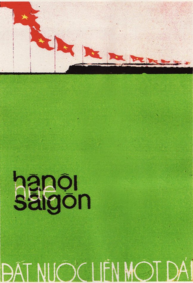
The first poster I choose to appropriate is Hanoi-Hue-Saigon: The Country Is United  (below) by artist Le Minh Ngu (1976). The poster was designed one year after the end of Vietnam War and the North and South Vietnam rejoined. I fell in love with the poster because of its gentle colors and peaceful composition.

Now, I would like to put a new tweak to it. Recently, Hanoi administrators have cut down over 6000 old trees in the city, creating public outrage. The reason is because these trees have great environmental, historical and social value to the city. Besides, admist many failed and untransparent actions by the government, people doubt that cutting down these trees will result in any good.

Hence, through my poster concept, I would like to convey the importance of green areas in the developing Vietnamese cities across the country. The main title of the poster, loosely translated, means “The Nation Needs Green Areas.” Above, I substituted the train with modern Vietnam city scapes. However, I am still experimenting with the fonts.

Hanoi – Hue – Saigon: The Country is United

Prior to coming up with these ideas, I had studied the compositions of various posters to brainstorm new concepts.

Poster Thumnail Study


The Mesmerizing Beauty of Vintage Posters

My next Surface Project involves stealing a design of a vintage poster, ranging from war propaganda, 1950s scifi posters to circus posters, and insert a new concept to it.

As a result, besides searching for a bunch of images online, I made a trip to the library and found some visual treasures.

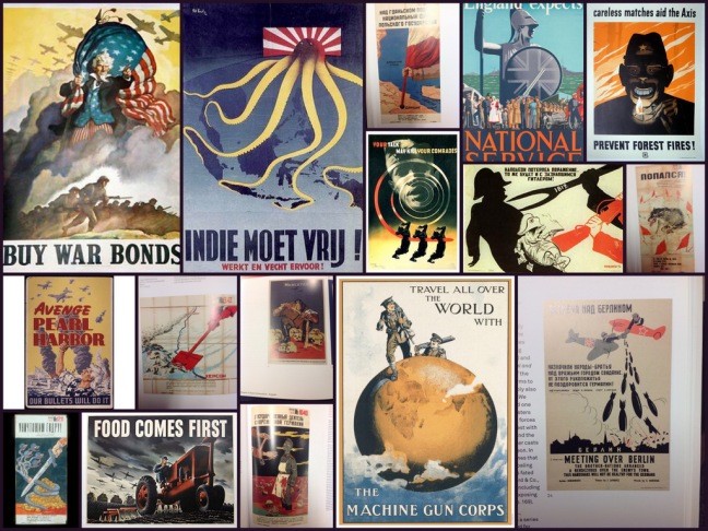
IMG_3273War is my favorite topic so I looked up many posters from World War 2. The collage includes my top favorites. The reason they draw my attention range from the concept, the perspective, the humor and the potential for me to impose a new concept on them.

WWII poster

Talking about the war, it would be a disgrace if I did not look up Vietnam War posters. And so I did. The design of Vietnamese propaganda posters at that time blew my mind with their creativity, concept and design.

Vietnam War Poster

I also looked up many scifi posters. Their complexities and intricacies intrigue me. But most importantly, all of them have great perspectives that draw my eyes in.

Scifi Posters

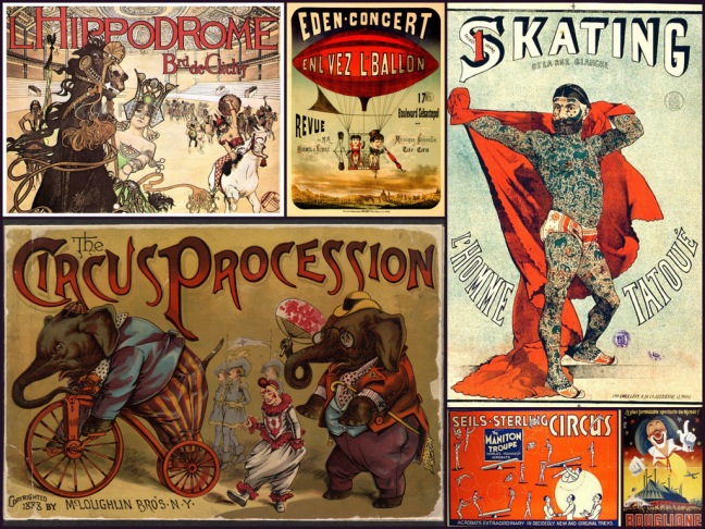
And lastly, I researched some circus posters. To me, it felt like travelling back to the golden age of circus while looking at these posters.

circus poster


3 Painful Lessons From My Latest Project

This is my third project done under course requirement of Surface Research. The goal of the project is to use patterns and colors. However, being someone who is interested in narratives, another goal I created for myself was to tell a story and convey an emotion.

I did not realize how challenging the project is until I was deep into it. Due to the use of many small patterns, I decided to use color pencils for the work. Filling a sheet of 30*20 inches with color pencil was a tedious process. In the end, since color pencils could not achieve the dark space I desired, I desperately resorted to using water colors under the suggestion of my instructor, Ms. Charlotte Rodenberg.

Besides, the project has revealed some of the weaknesses that need to be addressed.

1. Spending too much time on researching and experimenting.

These are important components of the work but they soon became unproductive when I did them out of fear of starting rather than out of necessity.

2. Being weak at shading and conveying forms.

As the work uses many complex geometrical shapes, I had difficulty conveying their forms and shadows using color pencils. I think this stems from my current weak foundation in shading.

3. Being rigid in my approach.

During critique, I saw some wonderful pattern works from my classmates. Though their works were purely focused on the perimeter of the assignment, which is creating patterns and using colors, they were superbly executed.

I, on the other hand, was not inspired originally by the creating “only patterns.” I thought the work would be boring if it did not tell a story. As a result, adding an extra component to the piece making it much harder and my execution fell short.

Looking back, I think I could have developed much more if I had embraced the assignment and developed an appreciation for pattern designs.

Ideas For The Next Surface Project

My next project is about using patterns and colors. That’s it. The first thought which came to my mind was to create a set of patterns and paint them. However, I felt that it wasn’t enough.

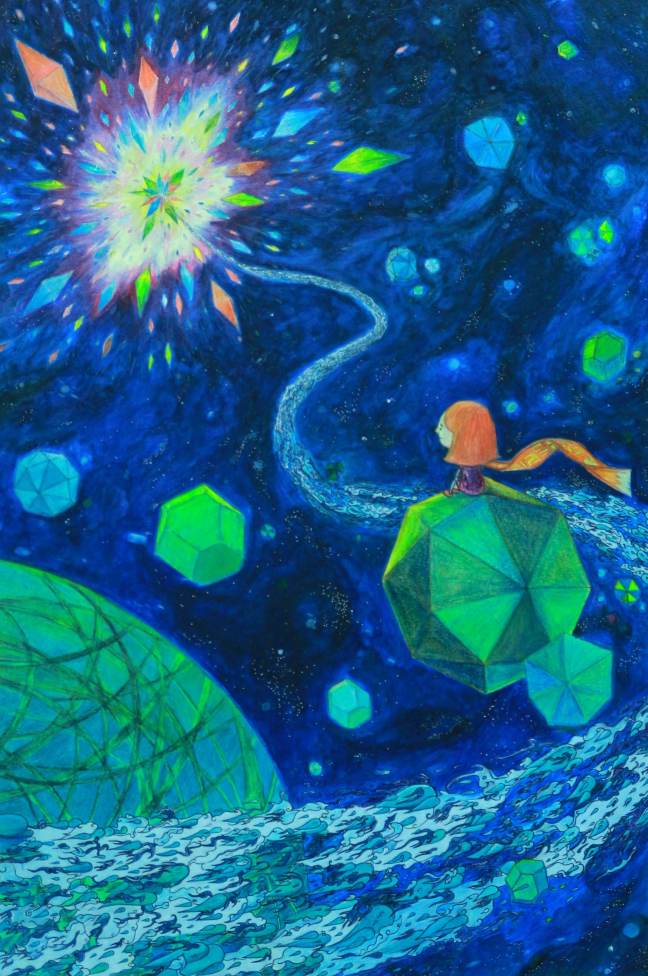
Instead, even with patterns, I want my drawings and paintings to tell a story, which is my first rule. Thus, the story I want to tell is that of a little cat, burdened by the troubles and ordeals of life, decides to escape into space, even for just a while. Sitting on the moon, she marvels her problems and painful feelings flowing towards the sun, where they are all destroyed and a beautiful things come out of that destruction. For the cat, it is a cathartic experience.

And like any stories, I want my illustration to convey an emotion, forming the second rule.

This brings me the color rules I would like to apply to my illustration. They act as a framework and I expect a lot of developments as the work progresses.

1. The colors create an illusion of space, shape and form.

The setting of the illustration is in space, with planets and asteroids. Hence, an illusion which conveys distance and forms is essential.

2. Most colors are analogous.

As I want to atmosphere to be introspective, peaceful, yet marvelous, the colors will be mostly cool and mostly analogous.

3. A few colors are complimentary or split-complimentary

The contrasts created by these colors will help me bring out the main subjects of the illustration, which are the cat and the explosion.

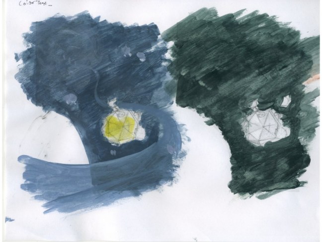
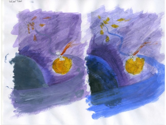
Below are some of my color tests. I mostly just played with the colors to see what came out of the process.

Color Test Compiled.004 Color Test Compiled.003 Color Test Compiled.002 Color Test Compiled.001

On My Instructor’s Artists Suggestions

As part of the pattern design project, our instructor, Miss Charlotte Rodenberg suggests several artists for us to look into. They include Julie Mehretu, Terry Winters, Sigmar Polke, Daniel Richter, David Salle, David Hockney, Gustav Klimt, AJ Fosik, and Trenton Doyle Hancock.

There are many artists with different styles and not all of them inspire me on the same level. AJ Fosik, in the end, turns out my favorite artist among all of the mentioned.

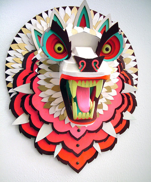
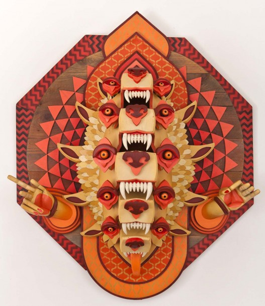
The first reason why his works intrigue me is because he is the only artist who creates 3D models and incoporate patterns on it. It is totally a personal preference that I prefer making stuffs.

aj fosik work

Regarding the patterns, he uses a nice balance of warm (yellow, green, red, pink) colors with cool ones (dark brown, black). I can see that the colors do not much gradient. They are solid, which creates the seemingly simplicity for the piece. A similar example can be seen below, where primary colors like red and yellow, which have been desaturated, are used. However, the piece below has more values within the same color, that is yellow.

3476935899_b0bcde0999

Another thing which I like about the his works is the organization and neatness of the patterns even though they are part of a complex culpture. Hence, somehow, I will steal his style and use for my works in the future.

1.bloodbone-527x610


Finding Inspiration For The Next Surface Project

My next Surface Project will be about creating patterns. However, pattern itself does not interest me. Beautiful patterns capture my attention because they are beautiful, but patterns which help tell a story are even more interesting. And so, I begin my quest to search for ideas and inspiration.

1. The Pattern Library

Beautiful website with gorgeous, professional designs. It’s awful lot to look at.

Pattern designs collection

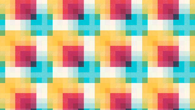
Among all the designs on the website, the below is my favorite one. The gradients within each shape make the colors pop. Besides, the use of complimentary colors (orange, blue) and analogous colors (yellow, orange) is simple yet mesmerizing.

pattern-library

2. Matt Booth

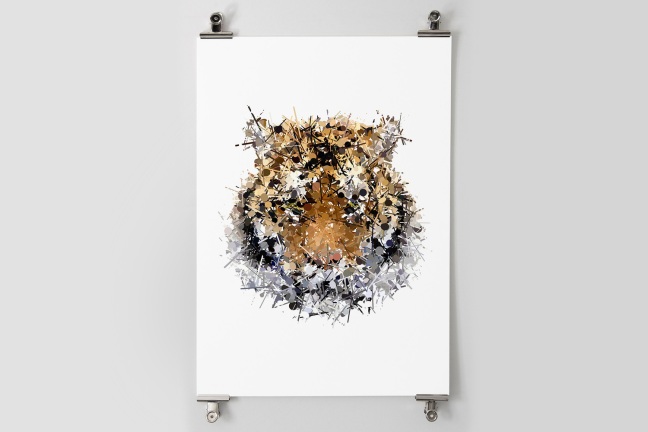
As I am interested in patterns in context, my research brought me to Matt Booth, whose patterns form awesome illustrations. The artist uses local colors of the tiger but incorporates a cirlce-stick patterns to it. the individual components are disorganized and messy, yet when gathered, create a meaningful whole.

sumatran-01


3. You Are Stardust

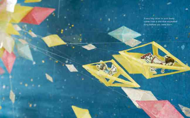
Almost coincidentally, I stumbled upon this gorgeous illustration by Soyeon Kim for the children book You Are Stardust. I specifically like to geometry of the shape and how different values create shape. Besides, it is a subtle approach to using primary colors, of which the result is beautiful. The work fits perfectly into my vision of how patterns can be used to tell a story.

you_are_stardust

youarestardust5

4. Chi Do

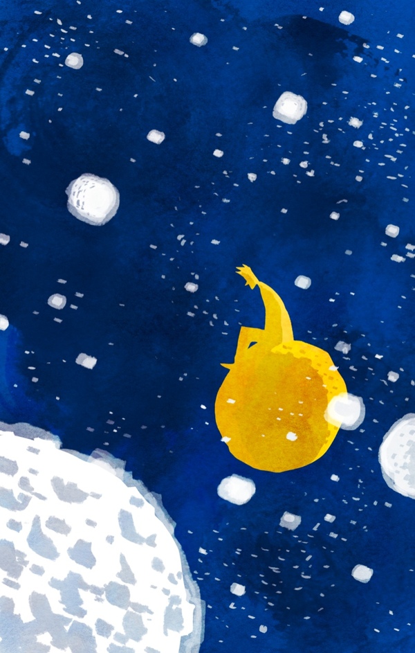
It is not so much of a pattern design piece, but it can potentially be due to the seemingly uniformity of the steroids and space. Also, it inspires me to tell a story of my own.

Chi Do So You Are Fine


Bánh Mì Stop Motion Animation

It is probably the most professional stop-motion I have made so far. This time, I managed to have a consistent light source and a clean yellow background. Unfortunately, the tripod I borrowed from the school library is crappy.

Nevertheless, I made use of what I had. So after 2 weeks, 2 sleepless nights and a total of 1146 photos taken, this very first stop motion animation about the Vietnamese sandwich is here.

I just hope more people, after seeing this animation, will want to eat this delicious dish.

3 Lessons I Learnt From Making My First Acrylic Painting

First Acrylic Painting, Monochromatic, Lessons Learnt

During the process of making my first acrylic painting, I have read a few books about painting, including Dynamic Acrylics and Keys To Successful Landscape Painting. By doing my best to apply some principles, I have learnt that:

1. Group lights and dark to increase contrast. It is not really about the colors, but the contrast.

For example, I learnt that cool shadows to make the sunshine look warmer so I was less hesitant to add some very dark areas into the painting.

2. Make the focal point the tonal climax.

This is because viewers’ eyes go from great contrasts to areas with high tonal relationships and to the focal point of a picture.  As a result, I intentionally include more values and tones in the three human figures and the dogs surrounding them.

3. Play!

I realized how much fun I had painting because it was my first time and I did not stress myself to create a masterpiece. As a result, I intuitively sprayed paint using a brush, grabbed a palette knife to apply paint, used my fingers to rub, and generally, not thinking much about what I would put on the painting.

Almost counterintuitively, I accomplished more thanks to that because I made a lot mistakes, which caused me to apply extra layers of paint. And according to my teacher, “the more layers you have, the more seductive your painting is.” So, I will remind myself to play the next time I pick up a brush or even a pencil.


Home, The First Acrylic Painting In My Life

This is my very first painting. Definitely, it didn’t come easily. I checked out several books on painting, acrylic techniques and watched multiple tutorials on color theory and painting in order to complete this piece.

In total, I have spent around 30 hours on this piece. However, I had great fun working on it because everything was new. Besides, it is a Lunar New Year gift for my grandma. That was a huge motivator for me.

I have also made a video about the process of creating this painting. Not every step is included in the video, so you might see a huge difference between the work-in-progress and the finished piece.

The Magic of Finding Vivian Maier

When a representative from the Bijou Film Center came to my Reading Film class to introduce about the screening of the oscar-nominated documentary Finding Vivian Maier, I was not that interested. However, nearing to end of the week, out of curiosity, I bought a ticket for the Sunday night show.

It was 20 degree (Fahrenheit) outside and I was riding my bike for 2 miles to reach the Byrd Theater. My phone, which was my GPS, died half way so I nearly got lost. There were other options for me to spend the night, but somehow, the desire to see this film was so great that I forced myself to go out.

There were more than 600 people at the theater that night. And the moment when I stepped into the Byrd for the first time, my journey paid off immediately. The grandeur, and majesty of the theater took my breath away. I kept staring at the mesmerizing main chandelier. Then, my eyes shifted to the grand piano, the gigantic columns and the elaborate decorations on the walls. It felt like I was in the 1920s.

Before the documentary began, a 1963 oscar-winner short film title The Critic was shown. Though I did not get most of the jokes, which the majority of the audience laughed at, the simple animations and the comical tones of the narrator entertained me.

Afterwards, Finding Vivian Maier began and I was slowly transported to another world. The serendipity of the whole story intrigued me deeply. What is the chance of a random guy, buying a box of negatives from an auction, which then turned out to belong to a prolific, mysterious, and private photographer, who took thousands of beautiful photos just to hide them away? As the documentary progressed, I knew that everyone was on the same page: We all wanted to know who Vivian Maier was and why she did the things she did.

In addition to the intriguing story, it fascinated to notice that the narration of the whole documentary came from direct interviews, conversations, questions, and answers gathered throughout the process of finding the mysterious photographer. The simplicity of the delivery was both effective and addicting.

At the end of the film, I left the theater with a sense of wonder and discovery. I had known more about this extraordinary yet private photographer. I had a glimpse of what great photography would look like and what went into creating great photos. Finally,  I had more faith that her works were now being seen and appreciated by people around the world.